


We draw before we write. We understand visuals and symbols before we understand words. Images for me have greater emotive power. There is greater interaction and association. It is the reason metaphors can be so powerful. If a metaphor allows us to hold two ideas in one, then visuals allow us to hold myriad ideas in a single image.
<>< <>< <>< <>< <>< … ><>

So we start with image, maybe even think in images more than words. And really we just change the medium of the language…a visual symbol for a more abstract one. Letters in many ways have great utility. 26 symbols (52 if we go for uppercase) plus some punctuation and we can communicate thought and feeling and imagination.
…
Still, a stick person gets the job done in fewer strokes. And while writing and words work for expression, images can often do so in a quicker manner.
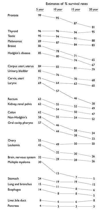
Infographics in many ways try to capture the usefulness of both words and image, but as simple as it would seem to combine them it often ends up in a mess. Even most of the stripped down versions displayed in the Tufte excerpts still remained visually overwhelming. The exception would be data set with cancer survival rates. This gave a subtle visual clue to enhance the information, which is the reason for graphic display of data.
The 13 Reasons sliding infographic was too distracting for me to really process the information in a meaningful way without effort. If the purpose of infographics is to make information more digestible, fun to share, and extremely engaging, then for me this presentation failed.
The article, cited in the 13 Reasons, on the use of brain images having a persuasive aspect in regard to articles on neuroscience was enlightening. It speaks to the idea of how images can be used to elevate the credibility of what is being said, even if they may in reality may not be relevant to the discussion. Chartjunk could at times fit into this category and become a base form of digital rhetoric, used to deceive and manipulate.
I enjoyed David McCandless’s TED Talk and agree with his idea of how data presentation can be beautiful. I was intrigued by how infographics can be useful in changing mindset by presenting vast amounts of information in more accessible formats that even allows for better analysis of the information. In a brief perusing of the website information is beautiful, there were many examples of infographics used to great effect. While the interactive nature of many of them increases their usefulness and demonstrated attention and consideration given to the end user/audience, I still found them data-dense and question how much information I would take with me after viewing them. Still, they do have an appreciable aesthetic.
Here is an infographic I made a number of years ago for my counseling practice. While it isn’t necessarily great, it was received well by my target audience and kept things simple enough to be useful.

I have been trying to recall my first encounter with a modern infographic and can’t. I can imagine thinking they were amazing and a unique way of communicating because some still elicit this response. But only some. Most don’t. They are just so much noise and I tune them out. They have become so common and mainstream that they barely register as information. Maybe I am craving simple, or maybe what I am craving is more interaction with the information. Generally speaking though I have the same shudder when seeing an infographic as I do when someone pulls up their powerpoint presentation.
Going along with my project I was playing around with spark just for a bit of fun and made this graphic. I was trying to hint a bit at the old punk posters of the day and to keep a simple and brief message: “Rise Up” and “Destroy Power Not People”

Thanks for visiting.

You must be logged in to post a comment.